Project Scope:
Concept development and creative direction
Adapting one source image into multiple campaign variations
Target audience research
Typography and layout design
Color management and PMS/duotone execution
Visual hierarchy and balance
Copywriting (headline, subhead, and CTA development)
Advertising Project
Tools Used:
InDesign
Photoshop
Illustrator
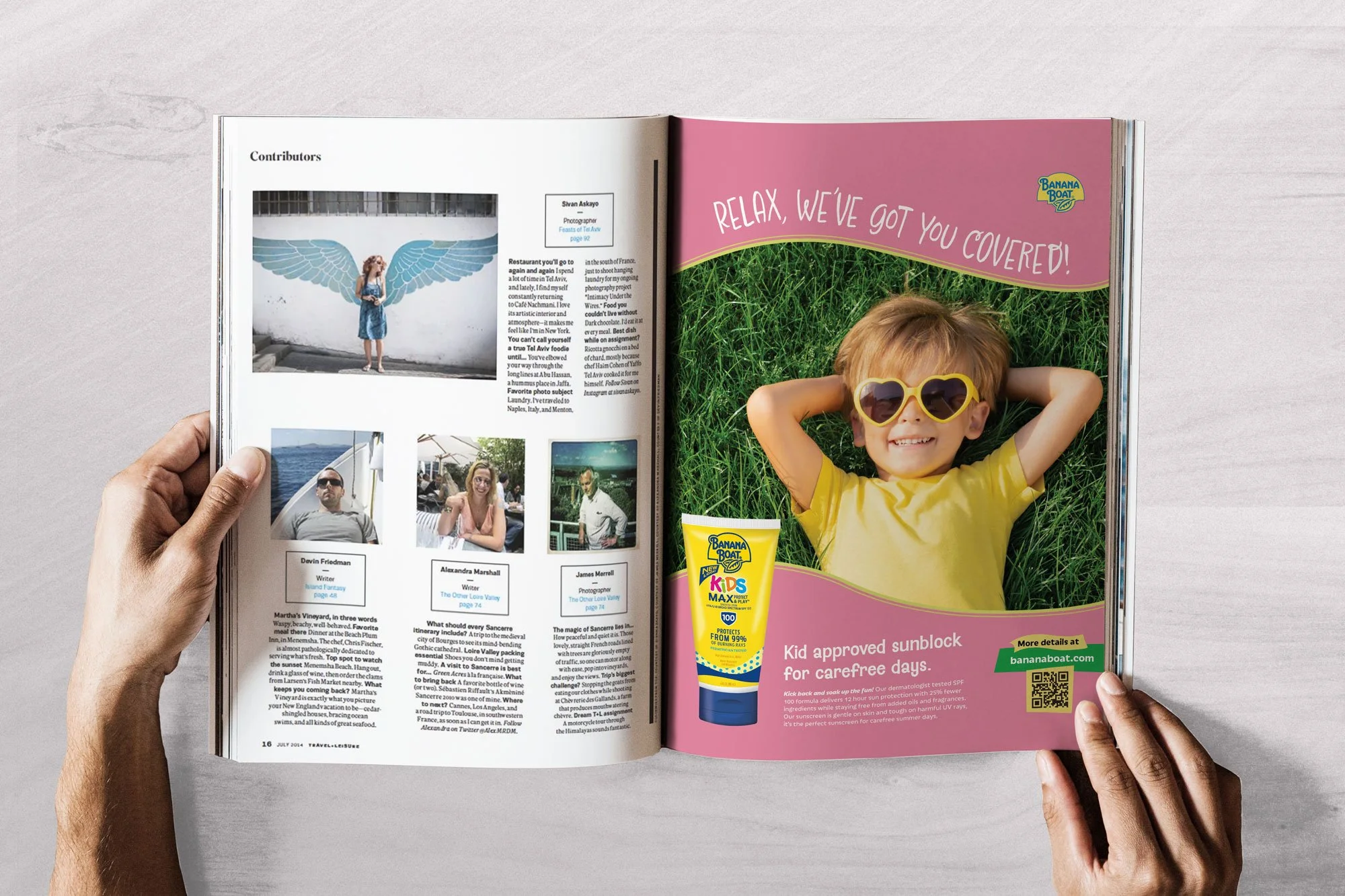
For this project I created four magazine advertisements based on a single provided stock photo. Each ad followed a different design specification with one being image dominant, one type dominant, one type and image equal (2 PMS colors), and one white space dominant (black & white). Ads were tailored to four different magazine audiences based upon what magazines we selected.
This project tested creativity, flexibility, and the ability to adapt a single visual asset into multiple compelling advertisements. I designed my ads for Southern Living, Parents, Fast Company, and an ad series for Travel + Leisure. Each ad reinterprets the same image through different design lenses using composition, typography, and color to fit the publication’s personality and audience.

Provided Stock Photo
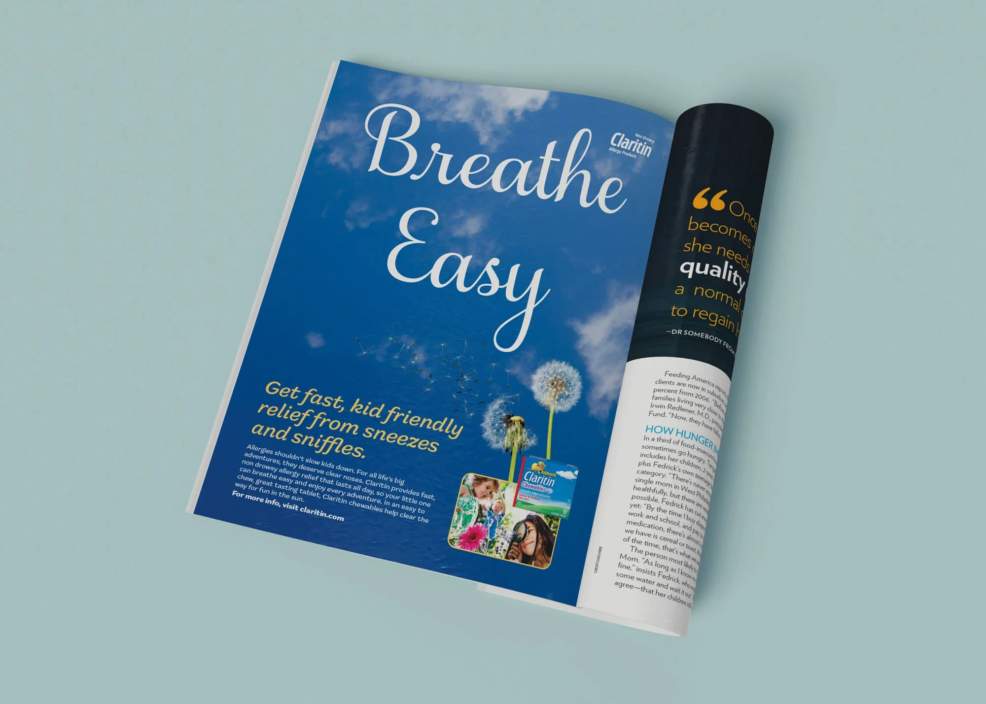
Claritin Kids Allergy Medicine
Type dominant
Full bleed / Full color
Parents Magazine
Kids Outdoor Summer Camp
Type and Image Equal
No Bleed / 2 PMS colors
Southern Living
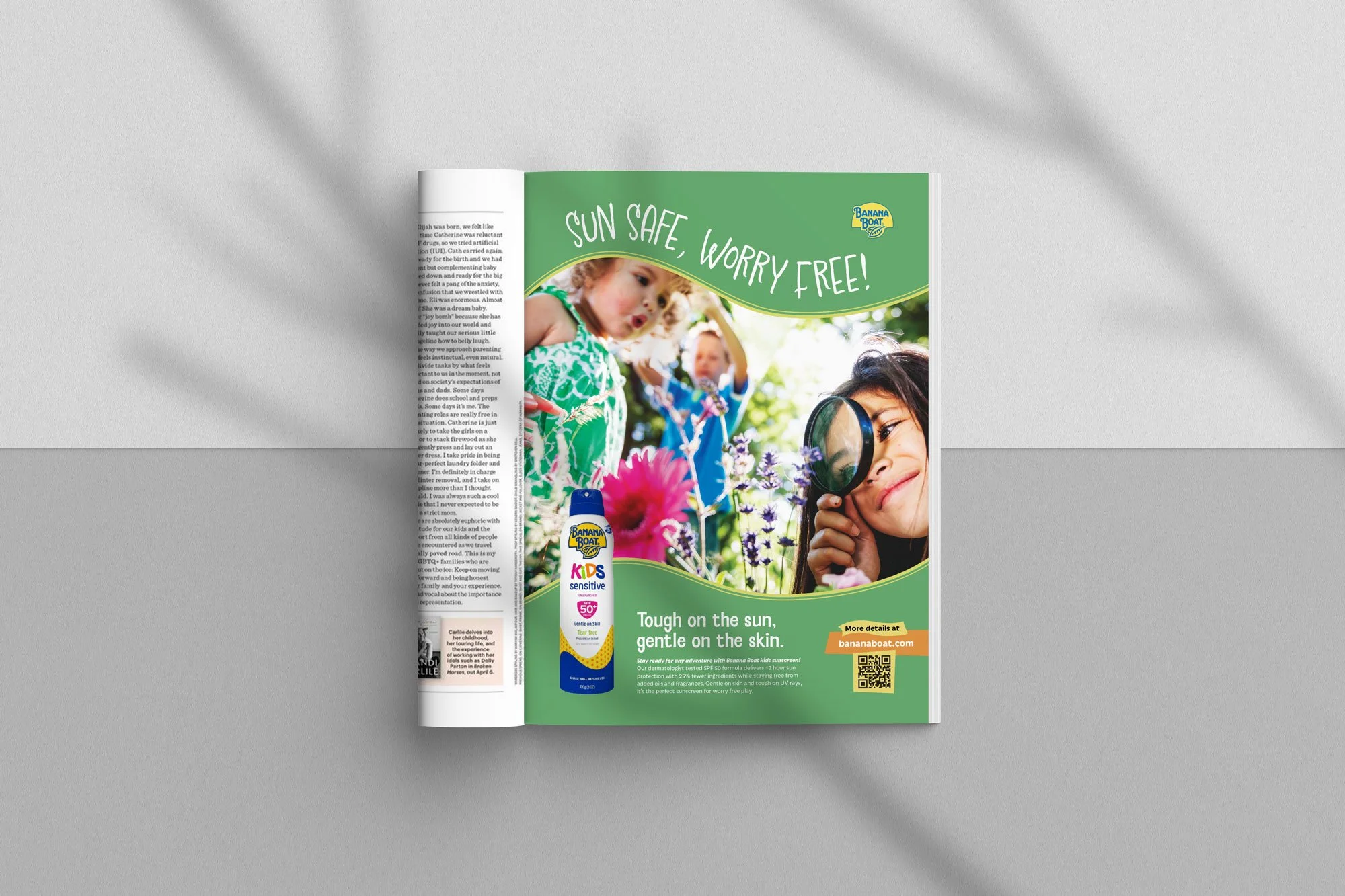
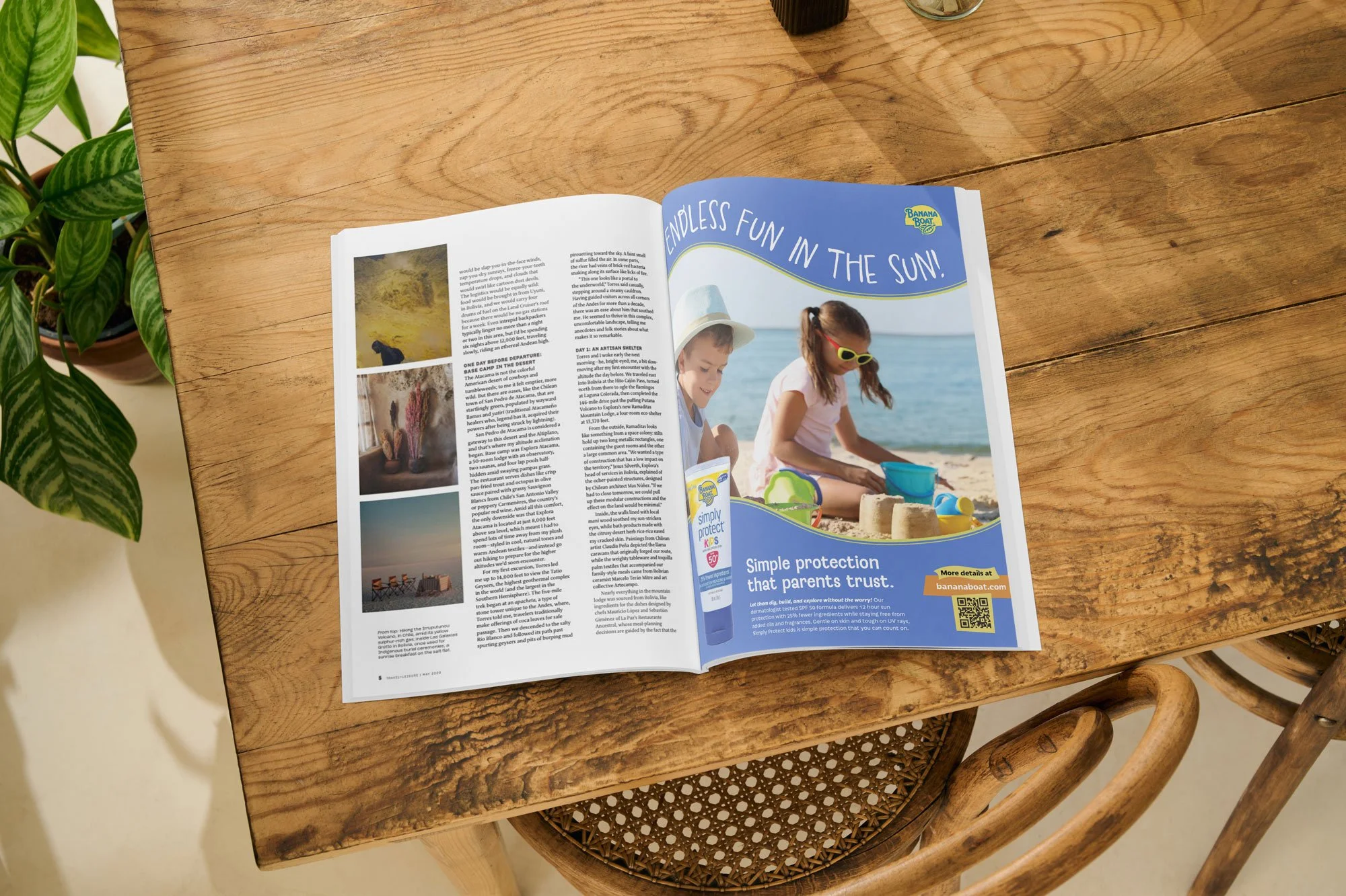
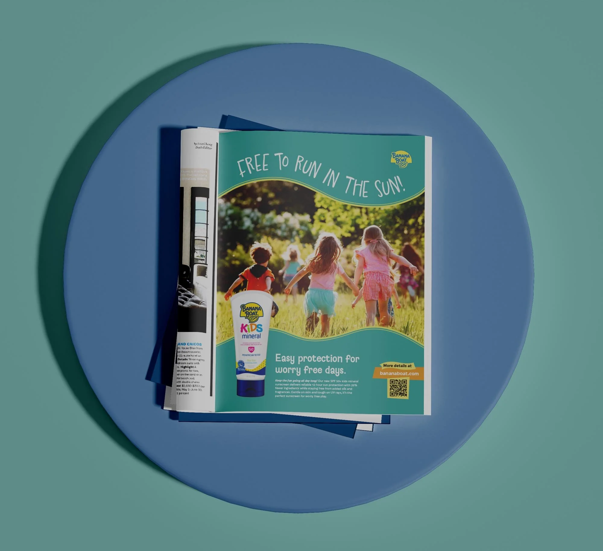
Banana Boat Kids Sunsceren
Image Dominant
Full bleed / Full color
Travel & Leisure
Business Insurance
White Space Dominant
Full Bleed / Black & White

